Reference · shadcn/ui Maia + GSAP

Build consistent.
Move with purpose.
Stay on brand.

A living reference for brand colors, GSAP motion presets, and component customizations. shadcn/ui (Maia style, Gray theme) is the design system — this repo documents everything we add on top.

shadcn/ui · Maia style Gray base color System UI + Lora + Poppins Hugeicons Tailwind v4 · OKLCH GSAP v3 Large radius (0.875rem)

Typography

Lora (serif) for h0–h1, Poppins for h2–h4 (and light-weight alternates h0-alt / h1-alt), system UI for body text and UI, Geist Mono for code.

h0The quick brown
h1

The quick brown fox

h0-altThe quick brown
h1-altThe quick brown fox
h2

The quick brown fox

h3

The quick brown fox jumps

h4

The quick brown fox jumps over

body

The quick brown fox jumps over the lazy dog. Body text uses the system font stack.

codeconst theme = "gray-maia";
Display & H1 Font
Lora (serif) · 400–700
h0 (400) and h1 (700) only
Headline Font
Poppins · 300, 600–800
h2–h4 + h0-alt / h1-alt (300)
Body Font
System UI · 400–700
All body, buttons, inputs
Code Font
Geist Mono · 400
Code blocks, inline code
Icons
Hugeicons
npm i hugeicons-react

Brand Colors

These are additive — they never replace shadcn semantic tokens. Apply via --brand-* only when a design explicitly calls for brand treatment.

Highlights

Navy
#0E1233
--brand-highlight-navy
Light
#FAFAFA
--brand-highlight-light

Surfaces

Surface Light
#E8E5DE
--brand-surface-light
Surface Dark
#0E1233
--brand-surface-dark

Offset Accents — Light surface

Lavender
#7267E2
--brand-offset-lavender-light
Green
#A0D246
--brand-offset-green-light
Yellow
#F8BC4D
--brand-offset-yellow
Coral
#FF7236
--brand-offset-coral-light
Blue
#006CDB
--brand-offset-blue-light

Highlights + Offsets — Dark / Blue surface

Light
#FAFAFA
--brand-highlight-light
Lavender
#B4AFE7
--brand-offset-lavender-dark
Green
#D5FD8D
--brand-offset-green-dark
Yellow
#F8BC4D
--brand-offset-yellow
Coral
#FF814C
--brand-offset-coral-dark
Blue
#2886E6
--brand-offset-blue-dark
When to use
Hero sections, marketing headings, CTAs, status badges, illustrations, gradient accents — any element the design explicitly marks as brand colored.
When NOT to use
Buttons, inputs, cards, body text, borders, error states, focus rings — use shadcn semantic tokens for all standard UI.

Sidebar Tokens

Eight --sidebar-* tokens power the shadcn Sidebar component. Do not use them as general color tokens outside of sidebar contexts.

TokenPurpose
--sidebarSidebar panel background
--sidebar-foregroundSidebar text
--sidebar-primaryActive nav item background
--sidebar-primary-foregroundActive nav item text
--sidebar-accentHover state background
--sidebar-accent-foregroundHover state text
--sidebar-borderSidebar border / divider
--sidebar-ringFocus ring inside sidebar
Tailwind v4 @theme block
tokens/colors.css includes a commented-out @theme inline block (Section 3). Copy it into your project's root CSS when using Tailwind v4 — it maps all CSS variables to Tailwind utilities (bg-primary, text-muted-foreground, etc.).
Sidebar vs. standard tokens
For page layouts that include a sidebar, use standard --background, --border, etc. tokens. Only use --sidebar-* tokens when styling the shadcn Sidebar component itself.

Spacing

4px grid — every value is a multiple of 4px (0.25rem). Maia style means generous spacing: when in doubt, size up.

Base Scale

TokenrempxTailwindVisual
0.50.12520.5
10.2541
20.582
30.75123
41164
51.25205
61.5246
82328
102.54010
1234812
1646416
2058020
2469624

Semantic Tokens

Inline
inline-xs · 4px · Icon-to-label gap inline-sm · 8px · Button icon gap inline-md · 12px · Nav link gap
Component Padding
component-xs · 6px · Badge, dropdown chrome component-sm · 10px · Button / input padding component-md · 16px · Compact card component-lg · 24px · Maia card default component-xl · 32px · Dialog / sheet
Gap (between siblings)
gap-xs · 8px · Tight list items gap-sm · 12px · Form fields gap-md · 16px · Card grid gap gap-lg · 24px · Section content gap-xl · 32px · Major blocks
Section & Page
section-sm · 48px · Compact section section-md · 64px · Default section section-lg · 96px · Major page section section-xl · 128px · Hero / footer page-gutter · 24px → 32px page-max-width · 1100px

Component Spacing

ComponentPaddingGap / Notes
Button0.625rem 1.25remIcon gap: 0.5rem
Button sm0.375rem 1rem
Button lg0.875rem 2rem
Input0.625rem 1.25remLabel gap: 0.5rem
Card1.5rem (p-6)Internal: 1rem
Dialog2rem (p-8)Actions: 0.75rem
Sheet1.5rem (p-6)
Dropdown0.375rem chromeItem: 0.5rem 0.75rem
Toast1rem 1.25rem
Accordion1rem 0.75remContent: 1rem
Badge0.2rem 0.625rem
Tabs0.5rem 0.875remList gap: 0.25rem

Guidelines

4px grid
All spacing is a multiple of 4px (0.25rem). No arbitrary values like 0.3rem or 7px.
Generous by default
Maia style. Cards get p-6 not p-4. Sections get mb-20 not mb-12. When in doubt, size up.
Gap over margin
Use flexbox/grid gap for layout spacing. Avoid margin for sibling separation.
44px touch targets
Interactive elements must be ≥44×44px. Use padding or min-height to reach this.

Responsive Design

Mobile-first. Default CSS targets mobile. Override upward with Tailwind md: and lg: prefixes. The primary layout breakpoint is 768px (md:).

Breakpoint Scale

TokenMin-widthTailwindUse
mobile0px(default)Base styles — all CSS starts here
sm640pxsm:Large phones landscape — rarely needed
md768pxmd:Primary breakpoint — layout shifts here
lg1024pxlg:Desktop — full multi-column layouts
xl1280pxxl:Wide desktop — optional refinement

Live Grid Demo — resize your browser to see columns change

📱 Mobile — 1 column

Card 1
Single column on mobile, 2 at md:, 3 at lg:
Card 2
Component padding stays the same at every breakpoint
Card 3
Only layout and page-level spacing adapt
Card 4
Typography scales fluidly with clamp()
Card 5
Page gutter: 1.5rem mobile → 2rem desktop
Card 6
Touch targets stay ≥44px on all screens

Container Behavior

Content area max-width: 1100px · centered · auto margins
◀ Gutter: 1.5rem mobile / 2rem desktop ▶

What Changes vs. What Stays Fixed

ElementMobile → DesktopChanges?
Component paddingSame everywhereNo
Page gutter1.5rem → 2remYes — at md:
Section spacingMay compress one stepYes — below md:
Grid columns1 → 2 → 3Yes — at md: and lg:
HeadlinesFluid via clamp()Fluid
Body text1rem fixedNo
Touch targets44px minimumNo

Fluid Typography

ElementValueMin → MaxNotes
h0clamp(3.5rem, 8vw, 6rem)56px → 96pxDisplay / hero text
h1clamp(2rem, 4vw, 2.75rem)32px → 44pxPage titles
h2clamp(1.5rem, 3vw, 1.75rem)24px → 28pxSection titles
body1rem (fixed)16pxNo scaling

Mobile Compaction — below 768px

Layout-level spacing compresses on mobile. Component-level spacing never changes.

TokenDesktopMobile (<768px)Tailwind
section-xl128px96pxpy-24 md:py-32
section-lg96px64pxpy-16 md:py-24
section-md64px48pxpy-12 md:py-16
section-sm48px32pxpy-8 md:py-12
gap-xl32px24pxgap-6 md:gap-8
gap-lg24px16pxgap-4 md:gap-6
gap-md16px16px (fixed)gap-4
Compresses on mobile
• Section spacing (one step down) • Layout gaps (gap-lg, gap-xl) • Page gutter (24px → 32px at md:) • Grid columns (1 → 2 → 3) • Headlines (fluid via clamp())
Fixed at every size
• Component padding (cards p-6, buttons, inputs) • Small/medium gaps (gap-xsgap-md) • Border radius • Touch targets (44px min) • Animation durations & easings

Guidelines

Mobile-first CSS
Default styles target mobile. Override upward with md: and lg:. Never write desktop-first CSS.
Layout shifts at md:
768px is where single-column becomes multi-column. Sidebars appear. Navigation expands.
Fluid typography
Use clamp() for h0–h2. No breakpoint-based font-size changes. Body stays at 1rem.
Fixed component padding
Buttons, cards, inputs keep the same padding at every screen size. Only page-level spacing adapts.
Section spacing compresses
Section margins and large gaps (gap-lg, gap-xl) each drop one step below md:.
Restructure, don't hide
If content matters on desktop, show it on mobile. Change layout (stack, reorder), not visibility.
Grid: 1 → 2 → 3 columns
grid-cols-1md:grid-cols-2lg:grid-cols-3. Standard pattern for card grids.

Mobile Overflow Prevention — minimum viewport: 320px

Prevent content cutoff on narrow screens. All layouts must work at 320px wide (iPhone SE / split-screen).

#RuleImplementation
1Minimum viewportAll layouts must be usable at 320px wide
2Table scroll wrappers<div class="table-scroll"> around every <table>
3Code block overflowpre { overflow-x: auto; }
4Break long wordsbody { overflow-wrap: break-word; }
5Safe grid minimumsminmax(min(Xpx, 100%), 1fr) — max safe: 272px at 320px
6Contain mediaimg, video, svg { max-width: 100%; height: auto; }
7Clamp overlay widthsTooltips, toasts, popovers: max-width: calc(100vw - 3rem)
8Collapse inline gridsMulti-column → single-column below sm (640px)
9Block page scrollhtml { overflow-x: clip; } — use clip not hidden

Global CSS Resets

Add to every project's global stylesheet:

/* Mobile overflow prevention */ html { overflow-x: clip; } body { overflow-wrap: break-word; } img, video, svg, canvas, iframe { max-width: 100%; height: auto; } pre { overflow-x: auto; } .table-scroll { overflow-x: auto; -webkit-overflow-scrolling: touch; }

Safe Grid Pattern

/* ✅ Safe — collapses to 100% on narrow screens */ grid-template-columns: repeat(auto-fill, minmax(min(220px, 100%), 1fr)); /* ❌ Unsafe — overflows at 320px when min > 272px */ grid-template-columns: repeat(auto-fill, minmax(280px, 1fr));

Vertical Content & Fixed Heights

Fixed-height containers (height: 100vh + overflow: hidden) are the most common cause of vertical content clipping on mobile. Content that fits on desktop often doesn't fit on a phone.

#RuleImplementation
1min-height not heightUse min-height: 100dvh — content can grow beyond viewport
2Slides scroll on mobileSlide/carousel containers: overflow-y: auto below md:
3No overflow: hidden on contentOnly for decorative wrappers (border-radius, image crops)
4dvh not vh100vh includes browser chrome on mobile. Use 100dvh.
5Reduce density or scrollIf 3 cards don't fit, scroll within slide or show fewer per slide
/* ✅ Section grows with content */ .hero { min-height: 100dvh; } /* ❌ Section clips content that doesn't fit */ .hero { height: 100vh; overflow: hidden; } /* ✅ Slide scrolls internally on mobile */ .slide { height: 100dvh; overflow-y: auto; } @media (min-width: 768px) { .slide { overflow-y: visible; } } /* ✅ dvh with vh fallback */ .full-screen { min-height: 100vh; /* fallback */ min-height: 100dvh; /* dynamic */ }
min-height not height
min-height: 100dvh lets content grow. height: 100vh clips it.
Slides scroll on mobile
Carousel/slide containers need overflow-y: auto below md:. Content that fits on desktop rarely fits on a phone.
dvh not vh
100vh includes browser chrome on mobile. 100dvh adjusts dynamically. Always provide vh fallback.

Sidebar Layout

BreakpointBehavior
Mobile (default)Sidebar hidden — use Sheet (mobile nav drawer) to reveal
md: (768px)Side-by-side — sidebar 280px fixed, content fills remaining width
Mobile sidebar pattern
Use a shadcn Sheet component (entrance: slideInLeft, exit: slideOutLeft) triggered by a hamburger button. Sheet width: min(280px, calc(100vw - 3rem)). Do not stack the sidebar below content — it pushes critical content below the fold.

Motion Tokens

All animations use GSAP v3. Every animation must check prefers-reduced-motion.

Durations

TokenValueVisualUse
instant100ms
Active/pressed
fast150ms
Hover, toggles
normal300ms
Modals, fades
slow500ms
Page sections
slower700ms
Staggered
slowest1000ms
Hero/cinematic
Note on 400ms
The slideIn* entrance presets use 400ms and slideOut* exit presets use 300ms. These are intentional intermediate values hardcoded in animations/presets.js — they do not map to a named duration token. When referencing these presets' timing, write 400ms explicitly.

Easings

NameGSAPUse
out (default)power2.outEntrances, general UI
inpower2.inExits
in_outpower2.inOutLayout shifts
overshootback.out(1.7)Modals, bounces
springelastic.out(1, 0.3)Springy — GSAP only
bouncebounce.outBounce — GSAP only

Reduced Motion

Mandatory accessibility requirement
Every animation must respect prefers-reduced-motion: reduce. The design system handles this automatically in most cases — read the rules below.
GSAP — use applyPreset()
The recommended path. applyPreset(gsap, target, "scaleIn") handles reduced motion automatically. For raw gsap.fromTo() calls, check manually: window.matchMedia("(prefers-reduced-motion: reduce)").matches and set duration: 0.
Scroll triggers — self-managed
All factory functions in scroll-triggers.js check reduced motion internally. revealUp/Left/Right and staggerReveal call gsap.set() (instant). parallax() and pinSection() return null. No extra guard needed.
CSS — already handled
All classes in animations/transitions.css include a @media (prefers-reduced-motion: reduce) block that sets all durations to 0ms and removes all transforms. No extra work needed.
RuleDetail
Never use raw gsap.to/from without a duration guardUse applyPreset() or check window.matchMedia() directly
Never hand-roll scrubbing without a reduced-motion guardUse the parallax() factory — it returns null automatically
Opacity-only fades ≤ 150ms are permissibleEven under reduced motion, pure fades under 150ms are acceptable
Translate and scale transforms → duration: 0All movement must be instant when reduced motion is active

Animation Presets

Click any card to replay. Presets live in animations/presets.js.

Entrance

fadeIn
opacity 0→1 · 300ms
Click to replay
slideInUp
y:24→0 · 400ms
Click to replay
slideInDown
y:-24→0 · 400ms
Click to replay
slideInLeft
x:-24→0 · 400ms
Click to replay
slideInRight
x:24→0 · 400ms
Click to replay
scaleIn
scale:0.95→1 · 300ms
Click to replay
expandIn
scaleY:0→1 · 300ms
Click to replay

Exit

fadeOut
opacity 1→0 · 200ms
Click to play
slideOutUp
y:0→-24 · 300ms
Click to play
slideOutDown
y:0→24 · 300ms
Click to play
scaleOut
scale:1→0.95 · 200ms
Click to play

Hover Interactions

Glow on hover (brand grass green)

CSS Transitions vs. GSAP

Use CSS Transitions for
Simple hover/focus/active states. Effects limited to transform, opacity, box-shadow. Anything reversible by removing a CSS class.
Use GSAP for
Component mount/unmount (Dialog, Sheet, Toast). Multi-step sequences or timelines. Scroll-triggered animations. Anything needing JS callbacks or ScrollTrigger.
CSS ClassEffectDuration
.transition-instantSets transition-duration100ms
.transition-fastSets transition-duration150ms
.transition-normalSets transition-duration300ms
.transition-slowSets transition-duration500ms
.hover-lifttranslateY(-4px) + shadow on :hover200ms
.hover-pressscale(0.97) on :active100ms
.hover-fadeopacity: 0.8 on :hover150ms
.focus-ringbox-shadow ring via var(--ring) on :focus-visible150ms

Scroll-Triggered Presets

PresetTriggerEffectScrub
revealUptop 85%y: 40 → 0, fade inNo
revealLefttop 85%x: −40 → 0, fade inNo
revealRighttop 85%x: 40 → 0, fade inNo
parallaxtop bottom → bottom topyPercent: −15Yes
staggerRevealtop 85%Stagger 0.08s, y: 30, fade inNo
pinSection(gsap, trigger, pinTarget, options)
Pins pinTarget in place while the user scrolls through trigger. Returns null under reduced motion — no pin applied. Use for sticky image / sticky sidebar layouts. Import from animations/scroll-triggers.js.

Logo Reveal

Icon: back.out(1.7), wordmark: power2.out.

Live Components

Interactive Maia-styled components with their assigned GSAP animations. Maia = soft, rounded, generous spacing. Pill-shaped buttons & inputs, ring-1 cards, and smooth motion.

Button rounded-4xl (pill) press: scale(0.97)
Input rounded-4xl (pill) bg-input/30
Badge rounded-4xl (pill)
Default Outline Featured Active Pro
Icons Hugeicons currentColor 20px default

Icons use currentColor so they adapt to light/dark mode automatically. Never hardcode a stroke or fill color — let the icon inherit from its parent.

Inline / Toolbar
Hover: --muted bg · Focus: --ring outline · Tab to test
Quick Action Tile
Add
Schedule
Focus
Reports
Hover: 18% muted · Focus: --ring outline · Tab to test
Navigation
Hover: subtle bg · Focus: --ring outline · Tab to test
Dark Mode
Because icons use currentColor, they flip automatically when --foreground changes from dark to light. Never set explicit colors like stroke="#333" or fill="black" — these break in dark mode. Icon container backgrounds use color-mix() with semantic tokens, so they adapt too.

Stroke Weight by Context

Contextstroke-widthNotes
Inline / toolbar (standard)1.5Default fallback for uncategorized contexts
Inline / toolbar (emphasized)1.75When extra visual weight is needed
Quick-action tile2Larger tap target, needs more presence
FAB (floating action button)2.5Prominent primary action
Navigation bar1.5Consistent with inline standard

Do not mix stroke weights within a single context. The 1.5 default is the fallback for contexts not listed above.

Card rounded-2xl ring-1 ring-foreground/10 hover-lift

Interactive Card

Hover to lift. Uses shadow-md + translateY(-4px).

Maia Borders

Uses ring-1 instead of border for the Maia aesthetic.

Static Card

Non-interactive cards don't need hover effects.

Card with Image rounded-2xl aspect-ratio: 16/9 overflow: hidden

Project Alpha

Image area uses aspect-ratio: 16/9 with muted background.

Active

Media Upload

Interactive cards use hover-lift and shadow escalation.

Static Variant

Custom ratio (4:3). No hover effect on non-interactive cards.

Chart --chart-1..5 rounded-2xl Recharts
Weekly Activity
Tasks completed per day
Mon
Tue
Wed
Thu
Fri
Sat
Sun
Weekday
Weekend
Color Reference
All five chart tokens
chart-1
chart-2
chart-3
chart-4
chart-5
chart-1
chart-2
chart-3
chart-4
chart-5

Chart Color Token Reference

TokenLightDarkData Series Role
--chart-1Warm orangeBluePrimary / first series
--chart-2TealGreenSecondary series
--chart-3NavyAmberTertiary series
--chart-4YellowPurpleQuaternary series
--chart-5AmberRedQuinary series
Assignment rule
Assign tokens by series order — --chart-1 for the first data series, --chart-2 for the second, and so on. Never skip a token or assign by color preference. Exact OKLCH values are in tokens/colors.css.
Field label + input + description error state
We'll never share your email.
Password must be at least 8 characters.
Choose your primary role.
Max 280 characters.
Dialog scaleIn / scaleOut back.out(1.7)
Sheet (right) slideInRight / slideOutRight
Dropdown Menu slideInDown / fadeOut
Tooltip fadeIn / fadeOut (150ms)
This is a tooltip
Another tooltip here
Toast slideInRight / slideOutUp
Accordion expandIn (scaleY) rounded-2xl
Maia is one of shadcn/ui's built-in styles — "soft and rounded, with generous spacing." It uses pill-shaped buttons and inputs (rounded-4xl), rounded cards (rounded-2xl), and ring borders instead of traditional borders.
GSAP offers physics-based easings (spring, bounce), fine-grained timeline control, ScrollTrigger integration, and a consistent API across all browsers. It also makes it easy to respect prefers-reduced-motion by setting duration to 0.
No. Never edit files inside components/ui/ directly so the shadcn CLI remains updatable. Customise via CSS variable overrides, Tailwind utility composition, or thin wrapper components.
Tabs fadeIn (150ms)
The Maia style brings a consumer-friendly, warm, approachable aesthetic to shadcn/ui. Key features include pill-shaped buttons (rounded-4xl), generous spacing (gap-6), and blue-tinted gray neutrals (OKLCH hue ~262).
Design tokens are defined in tokens/colors.css (Gray theme OKLCH values), tokens/motion.yaml (duration & easing), and tokens/brand-colors.yaml (additive brand palette). The --radius is set to 0.875rem (large).
Install shadcn/ui via their CLI, choose Maia style and Gray base color. Copy tokens/colors.css into your global stylesheet. Import GSAP presets from animations/presets.js. Use Lora for h0/h1, Poppins for h2–h4, and the system font stack for everything else.

Animation Assignment Reference

ComponentEntranceExitHoverNotes
Dialog / AlertDialogscaleInscaleOutScale + overshoot
Sheet (left)slideInLeftslideOutLeftMobile nav drawer
Sheet (right)slideInRightslideOutRightMatches open side
DropdownMenuslideInDownfadeOutDrops down, fades out
PopoverscaleInfadeOutScale from trigger
TooltipfadeIn 150msfadeOut 150msFast & subtle
ToastslideInRightslideOutUpSlides in, dismisses up
AccordionexpandInreverse expandInHeight from top
TabsfadeIn 150msQuick crossfade
NavigationMenufadeInDropdown submenu
Card (interactive)hover-lift CSSShadow escalation
Buttonhover-press CSSscale(0.97) on :active

Are you sure?

This action cannot be undone. This will permanently delete your account and remove your data from our servers.

Sheet Panel

This is a sheet that slides in from the right using the slideInRight GSAP preset.

Images

Patterns, CSS utilities, aspect ratios, focal points, loading attributes, overlay recipes, and shadcn AspectRatio / Card / Avatar mappings. All demos use hero-market.jpg.

Hero / Full-bleed height: 60dvh object-fit: cover border-radius: 0 loading="eager"
Two people selecting produce at a farmers market
/* .img-hero — standalone <img>, no container needed */ .img-hero { display: block; width: 100%; height: 60dvh; min-height: 280px; object-fit: cover; object-position: 28% center; /* focal point left-of-centre */ } @media (max-width: 767px) { .img-hero { height: 40dvh; } }
<img class="img-hero" src="hero-market.jpg" alt="Descriptive alt text" loading="eager" decoding="sync" />
Hero — Text Overlay img-hero-wrap img-hero-scrim img-hero-content Lora headline + CTAs
Two people selecting produce at a farmers market
Fresh & Local

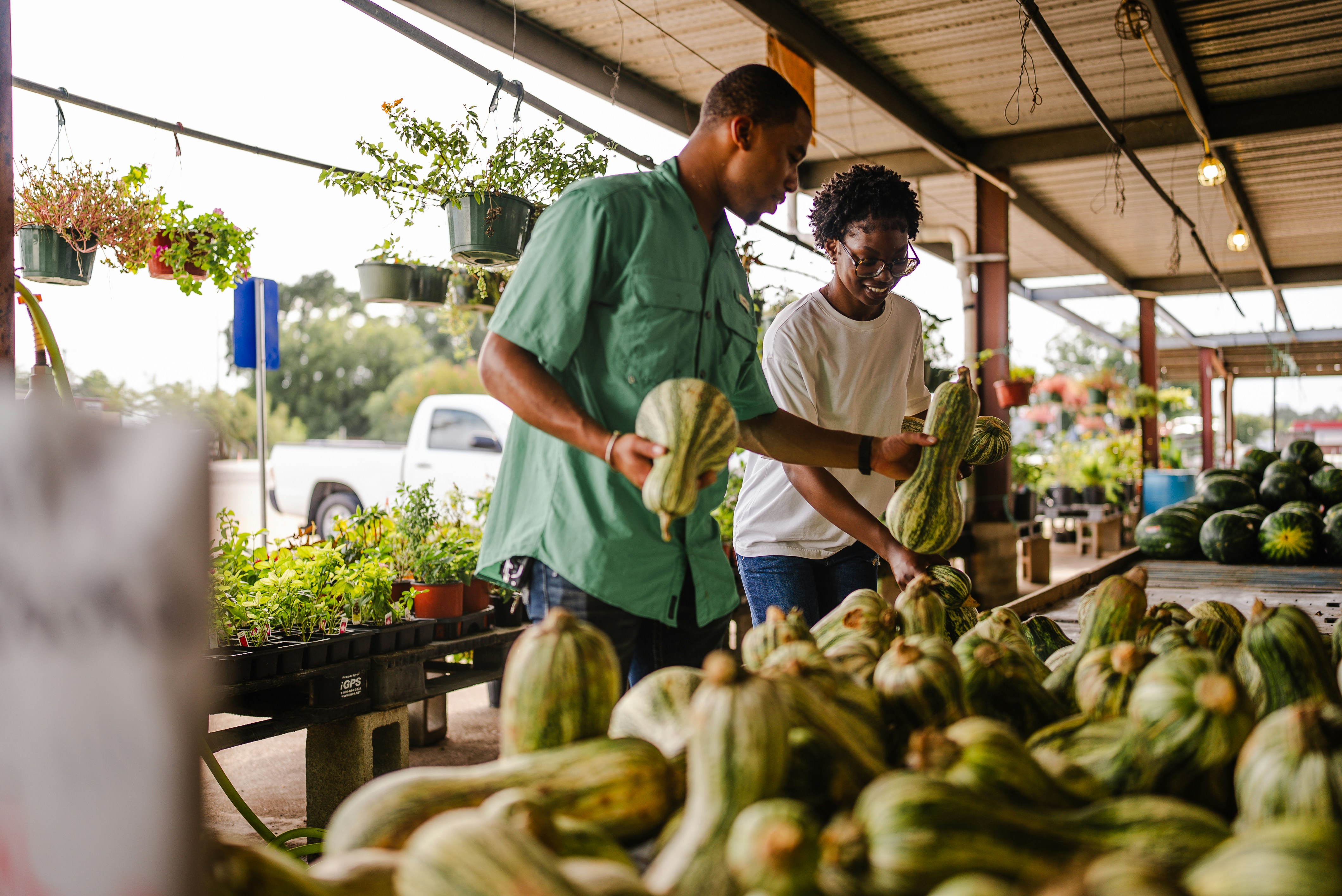
The market, at your doorstep.

Seasonal produce from regional growers, delivered every Thursday.

/* .img-hero-wrap owns the height; .img-fill fills it */ /* Use .img-fill — NOT .img-hero — inside the wrap */ <div class="img-hero-wrap"> <img class="img-fill" src="photo.jpg" alt="…" loading="eager" decoding="sync" style="object-position:28% center;" /> <div class="img-hero-scrim"></div> <!-- dark gradient, bottom-up --> <div class="img-hero-content"> <span>Eyebrow label</span> <h2 class="img-hero-headline">Headline copy.</h2> <p class="img-hero-sub">Supporting sub-copy.</p> <div class="img-hero-actions"> <button class="maia-btn maia-btn-primary">Primary CTA</button> <!-- Outline on dark bg: override color + box-shadow --> <button class="maia-btn maia-btn-outline" style="color:#fff;box-shadow:inset 0 0 0 1.5px rgba(255,255,255,0.55);"> Secondary CTA </button> </div> </div> </div>
Hero — Split Panel img-hero-split grid 1fr + min(46%, 460px) card panel stacks ≤600px
Farmers market — wide view
Local · Seasonal

Start shopping local today.

Connect with farmers in your area and get the freshest produce, harvested the same morning.

/* Split: CSS grid — panel reflows below image on narrow screens */ <div class="img-hero-split"> <div class="img-hero-split-image"> <img src="photo.jpg" alt="…" loading="eager" decoding="sync" /> </div> <div class="img-hero-split-panel"> <!-- badge, h3, p, then CTA buttons --> <h3>Headline.</h3> <p>Supporting copy.</p> <button class="maia-btn maia-btn-primary" style="width:100%;">Primary</button> <button class="maia-btn maia-btn-outline" style="width:100%;">Secondary</button> </div> </div>
Section Image — Editorial aspect-ratio: 21/9 border-radius: var(--radius) loading="lazy"
Farmers market — editorial wide
/* .img-ar — aspect-ratio wrapper. Set --ar inline. */ .img-ar { position: relative; width: 100%; aspect-ratio: var(--ar, 16/9); overflow: hidden; background: var(--muted); /* placeholder while loading */ } .img-ar img { display: block; width: 100%; height: 100%; object-fit: cover; }
<div class="img-ar" style="--ar:21/9; border-radius:var(--radius);"> <img src="hero-market.jpg" alt="…" loading="lazy" decoding="async" /> </div>
Section Image — Side-by-side img-text-grid grid 1:1 badge + headline + body + CTAs stacks on mobile
Farmers market produce
Seasonal

Grown within 50 miles.

Every item is sourced from farms within a 50-mile radius. We verify provenance at intake and publish full supply-chain transparency reports monthly.

/* Image left, text right */ <div class="img-text-grid"> <div class="img-ar" style="--ar:4/3; border-radius:var(--radius);"> <img src="photo.jpg" alt="…" loading="lazy" /> </div> <div class="img-text-grid-body"> <h3>Headline</h3> <p>Body copy.</p> </div> </div> /* Text left, image right — swap DOM order */ <div class="img-text-grid"> <div class="img-text-grid-body">…</div> <!-- text first = left col --> <div class="img-ar">…</div> <!-- img second = right col --> </div>
Section Image — Figure + Caption <figure> img-figure img-caption credit line
Vendors at the Riverside Farmers Market
Riverside Farmers Market — Weekly outdoor market featuring 40+ local vendors. Open every Saturday, 8am–2pm. Photo: Jane Doe / Maia Studio
<figure class="img-figure"> <div class="img-ar" style="--ar:21/9; border-radius:var(--radius);"> <img src="photo.jpg" alt="…" loading="lazy" /> </div> <figcaption class="img-caption"> <strong>Location name</strong> — Description copy. <span style="display:block;margin-top:0.25rem;opacity:0.65;"> Photo: Photographer / Studio </span> </figcaption> </figure>
Card Cover — 3-up Grid aspect-ratio: 16/9 shadcn: AspectRatio + Card object-position variants
Farmers market — left focal point

Left Focal Point

object-position: 28% center — subject left of centre.

Farmers market — right focal point

Right Focal Point

object-position: 60% center — space left for overlay text.

Farmers market — top focal point

Top Focal Point

object-position: center top — upper portion. Suits faces.

/* Card cover — real <img> replaces SVG placeholder */ <div class="maia-card-image"> <div class="maia-card-image-area" style="padding:0;"> <img src="photo.jpg" alt="…" style="width:100%;height:100%;object-fit:cover;object-position:28% center;" loading="lazy" decoding="async" /> </div> <div class="maia-card-image-body">…</div> </div>
Aspect Ratio Reference 21/9 16/9 4/3 1/1 3/4
21:9 ratio

21 / 9

16:9 ratio

16 / 9

4:3 ratio

4 / 3

1:1 ratio

1 / 1

3:4 ratio

3 / 4

/* All ratios — one class, one property */ <div class="img-ar" style="--ar: 21/9;"><img … /></div> <div class="img-ar" style="--ar: 16/9;"><img … /></div> <div class="img-ar" style="--ar: 4/3;"><img … /></div> <div class="img-ar" style="--ar: 1/1;"><img … /></div> <div class="img-ar" style="--ar: 3/4;"><img … /></div>
Background with Text Overlay linear-gradient to-top --brand-highlight-navy color-mix
Farmers market with overlay

Fresh from the Farm

Seasonal produce sourced directly from local growers. Updated weekly.

/* Overlay structure */ <div class="img-overlay-wrap img-ar" style="--ar:16/9; border-radius:var(--radius);"> <img src="photo.jpg" alt="…" loading="lazy" decoding="async" /> <div class="img-overlay"></div> <div class="img-overlay-content"> <h4>Heading</h4> <p>Supporting copy</p> </div> </div>
/* Gradient recipe — navy to transparent, bottom-up */ .img-overlay { background: linear-gradient( to top, var(--brand-highlight-navy) 0%, color-mix(in srgb, var(--brand-highlight-navy) 60%, transparent) 40%, transparent 75% ); }
Avatar / Thumbnail border-radius: 50% 5 sizes initials fallback shadcn: Avatar
User avatar XL
xl · 64px
User avatar LG
lg · 48px
User avatar MD
md · 36px
User avatar SM
sm · 28px
User avatar XS
xs · 20px
JD
initials fallback
/* Image avatar */ <div class="img-avatar img-avatar-lg"> <img src="user.jpg" alt="Jane Doe" loading="lazy" decoding="async" /> </div> /* Initials fallback — no <img> */ <div class="img-avatar img-avatar-lg" style="background:var(--brand-surface-grey);"> <span class="img-avatar-initials">JD</span> </div>

Image Composition Patterns

PatternCSSWhen to useMobile
Image only.img-hero / .img-arImage communicates standalone; no text neededHeight compresses; ratio holds
Text overlay — bottom.img-hero-wrap + .img-hero-scrim + .img-hero-contentMarketing heroes, event banners, editorial covers with atmospheric photographyWrap shrinks to 40dvh; content stays bottom-anchored
Split panel.img-hero-splitSign-up/auth heroes, landing page primary CTAs, feature intros requiring a form or bullet listStacks: image top (35dvh) + panel below at ≤600px
Image + text grid.img-text-grid + .img-text-grid-bodyFeature rows, "about" sections, editorial articles — when copy needs equal visual weight to imageSingle column; image first by DOM order
Figure + caption<figure> + .img-figure + .img-captionArticles, press releases, documentation — anywhere attribution or context is needed below the imageFull width; caption wraps naturally

Aspect Ratios by Image Type

TypeRatioCSSNotes
Hero / Full-bleedVariable height.img-hero · height: 60dvhHeight in dvh units, not a fixed ratio
Section / editorial21 : 9.img-ar · --ar: 21/9Wide editorial break between sections
Card cover (default)16 : 9.maia-card-image-areaOverride inline for 4:3 or 1:1
Blog thumbnail4 : 3.img-ar · --ar: 4/3Compact, good for sidebars
Square / product1 : 1.img-ar · --ar: 1/1Product shots, avatar grids
Portrait / profile3 : 4.img-ar · --ar: 3/4Team cards, author bios
Avatar1:1 circular.img-avatar.img-avatar-{size}50% border-radius on container

object-position Focal Point System

ValueEffectWhen to use
center centerDefault · geometric centreSymmetric subjects, products
28% centerLeft-of-centrehero-market.jpg default — subject occupies left third
60% centerRight-of-centreSubject right, space left for text overlay
center topUpper portion visibleFaces, sky-dominant landscapes
center bottomLower portion visibleGround-level subjects, food dishes
50% 20%Custom fine-tuneWhen keyword values are insufficient

Border-radius by Image Type

TypeContainer radius<img> radiusRule
Hero / full-bleed00Bleeds edge-to-edge, no radius
Section / editorialvar(--radius)0Radius on .img-ar container only
Card cover1rem via .maia-card-image0overflow:hidden on card clips the image
Avatar50% via .img-avatar0Container is circular; image fills it

Cardinal rule: never put border-radius on <img>. Apply it to the container with overflow: hidden. This prevents pixel gaps in scaled states and avoids double-radius artefacts.

loading and decoding Attributes

Image typeloadingdecodingReason
Hero (above fold)eagersyncLCP element — must load immediately, no deferral
Section / cardlazyasyncBelow fold — async avoids main-thread jank
Avatar in headereagerasyncIn viewport but small — async decode is safe
Avatar in contentlazyasyncBelow fold; defer both

Responsive Behaviour

PatternDesktop (≥768px)Mobile (<768px)
Hero height60dvh40dvh (via media query)
aspect-ratio containersRatio maintainedRatio maintained — inherently responsive
3-up card grid3 columns1 column via .img-card-grid
Avatar sizesFixed pxFixed px — never scale with vw
Section imageFull container widthFull container width, ratio intact

Overlay Gradient Recipes

RecipeCSS valueUse
Navy to-top (default)linear-gradient(to top, var(--brand-highlight-navy) 0%, color-mix(in srgb, var(--brand-highlight-navy) 60%, transparent) 40%, transparent 75%)Card overlays, editorial callouts
Navy full scrimlinear-gradient(to top, var(--brand-highlight-navy) 0%, color-mix(…80%) 60%, transparent 100%)Busy hero images needing heavy scrim
Subtle vignetteradial-gradient(ellipse at center, transparent 50%, color-mix(…40%, transparent) 100%)Edge-darkening decorative backgrounds

overflow: hidden Containment

Whereoverflow: hidden?Reason
.img-ar, .img-avatar, .img-overlay-wrap, .maia-card-imageYes — alwaysClips image to container, enforces border-radius
<img> element itselfNeverNo meaningful overflow; apply to wrapper
Layout / content containersNoWould clip shadows, focus rings, tooltips
Scrollable regionsUse overflow-y: autoNever hide content in scrollable areas

shadcn Component Mapping

shadcn

AspectRatio

Radix UI wrapper that applies aspect-ratio + overflow: hidden.

This system →

.img-ar with --ar custom property

shadcn

Card (image variant)

Card with top image area at 16:9, body below. Interactive with hover elevation.

This system →

.maia-card-image + .maia-card-image-area

shadcn

Avatar

Circular container with image, 50% radius, overflow: hidden, initials fallback.

This system →

.img-avatar.img-avatar-{size} + .img-avatar-initials

CSS Class Reference

ClassApplied toKey propertiesNotes
.img-hero<img> directlyheight:60dvh · object-fit:cover · object-position:28% centerNo container needed; 40dvh on mobile
.img-fill<img> inside sized containerwidth:100% · height:100% · object-fit:coverContainer must have explicit dimensions
.img-arContainer <div>aspect-ratio:var(--ar,16/9) · overflow:hiddenSet ratio via style="--ar:4/3"
.img-avatarContainer <div>border-radius:50% · overflow:hidden · display:flexAlways pair with a size modifier
.img-avatar-{xl|lg|md|sm|xs}Same container as .img-avatarwidth/height: 64/48/36/28/20pxFixed px — never scale with viewport
.img-avatar-initials<span> inside .img-avatarPoppins 600 · 0.75em · var(--muted-foreground)Fallback when image unavailable
.img-overlay-wrapContainer <div>position:relative · overflow:hiddenParent of image + overlay + content layers
.img-overlay<div> inside .img-overlay-wrapposition:absolute;inset:0 · gradient backgroundpointer-events:none — passes clicks through
.img-overlay-content<div> inside .img-overlay-wrapposition:absolute;bottom:0 · padding:1.5rem · color:#fffText layer above gradient

Get Started

Set up a new project with shadcn/ui Maia + Gray theme.

1
Scaffold your framework
# Next.js npx create-next-app@latest my-app --typescript --tailwind --eslint
2
Install shadcn/ui (Maia style, Gray base)
npx shadcn@latest init # Choose: Gray base color, Maia style, Large radius
3
Install GSAP + Hugeicons
npm install gsap hugeicons-react
4
Add Lora + Poppins for headlines
/* Google Fonts */ /* Lora: ital,wght@0,400;0,700;1,400 | Poppins: wght@600;700;800 */ h1, .h0 { font-family: "Lora", Georgia, serif; } h2, h3, h4 { font-family: "Poppins", sans-serif; }
5
Copy brand tokens
:root { --brand-surface: #E8E5DE; --brand-highlight-navy: #0E1233; --brand-highlight-light: #FAFAFA; --brand-offset-lavender: #7267E2; --brand-offset-green: #A0D246; --brand-offset-yellow: #F8BC4D; --brand-offset-coral: #FF7236; --brand-offset-blue: #006CDB; }
6
Import animation presets
import { ENTRANCE, EXIT, HOVER } from "@/design-system/animations/presets";
Key files
DESIGN-SYSTEM.md · Full spec
tokens/colors.css · CSS variables (Gray theme)
tokens/motion.yaml · Duration & easing tokens
animations/presets.js · GSAP presets
components/shadcn-customizations.yaml · Overrides

Mobile Example

A realistic mobile app — "Focus" — built entirely from design system components. Buttons, inputs, badges, cards, tabs, accordion, bottom sheet, toasts, FAB, and bottom nav all working together in a phone-frame layout.

Fully interactive — click, scroll, check tasks, fire toasts.

Components used
• App bar + status bar mock • Maia pill search input • Stat cards (maia-card) • Featured project card + progress bar • Quick actions grid (4-up) • Task list with checkboxes • Tabs (Today / Upcoming / Completed) • Accordion (Project Notes) • Bottom sheet (add task) • FAB • Bottom navigation bar • Toast notifications • Badges (lavender / blue / navy / default)
Animation patterns
• Staggered entrance sequence on load • Progress bar animated fill (0→62%) • Button micro-lift + back.out(2) spring • FAB scale bounce on hover • Task check — back.out(2.2) pop • Bottom sheet — slide up from 100% • Toast — back.out(1.5) slide-up entry • Accordion chevron nudge on hover • Tab panel y:8→0 fade-slide • Scroll reveal for lower sections
Fonts in use on this screen
Lora · Serif · 400 / 700 Good morning h1 · greeting heading only
System UI · Sans · 400–700 Everything else buttons · labels · stats · nav · badges
2 families · Poppins not loaded
Open standalone
View at full size or inspect source in a separate tab.
Open example-mobile.html

Pitch Deck Slide

A Series A pitch slide for "Aria" — a fictional AI payments startup. Dark navy background, Lora headline for emotional impact, System UI for all data and labels. 16:9 desktop format.

SvelteKit + shadcn-svelte — static export

Slide components
• Series badge pill (offset-green border) • Lora 700 headline (3.1rem) • Body subtitle (System UI, muted) • Stats row: $2.4M ARR / 18% MoM / 340 customers • Wordmark badge (bottom-left) • Radial glow + decorative ring (right column) • Dot grid overlay (decorative)
Design decisions
• Dark navy bg — authority + brand depth • Lora for the headline only — max emotional pull • System UI for all data — stays crisp at small sizes • Right column abstract visual avoids literal imagery • Stats use weight + size hierarchy, not color
Fonts in use on this screen
Lora · Serif · 700 The AI layer h1 · slide headline only
System UI · Sans · 400–700 $2.4M ARR stats · labels · subtitle · wordmark
2 families · Poppins not loaded
SvelteKit
Open standalone
View at full 800×450 resolution or inspect source.
Open example-pitchdeck.html

Startup Landing Page

Above-the-fold hero for "Aria" — light mode. Full nav + eyebrow badge, Lora headline, CTA pair, and social proof strip. Desktop 800×500.

SvelteKit + shadcn-svelte — static export

Page components
• Flat nav bar (logo + links + CTA) • Full-bleed photo — extends behind entire hero area • Solid white card (45%) overlaid right — no fade • Eyebrow badge "Now in private beta" • Lora 700 headline (2rem) • Subtitle paragraph (System UI) • CTA pair: filled primary + ghost • Social proof strip (4 company names)
Design decisions
• Hero photo anchors human context; copy stays minimal • Hard card edge — white panel sits over photo, border-left divider • Lora upright — authority without decoration • Ghost CTA lowers barrier vs. single primary • Social proof muted — present but not competing
Fonts in use on this screen
Lora · Serif · 700 Payments that feel human. h1 · page headline only
System UI · Sans · 400–700 Everything else nav · buttons · badge · subtitle · proof
2 families · Poppins not loaded
SvelteKit
Open standalone
View at full 800×500 resolution or inspect source.
Open example-landing.html

Customer Review Platform

A mobile review screen for "Trustflow" — showing the Aria product page with a rating summary, star breakdown bars, filter chips, and review cards. System UI only — no web font needed.

SvelteKit + shadcn-svelte — fully interactive

Screen components
• App bar (back + title + kebab) • Rating summary: 4.7 ★, 2,341 reviews • 5-row star breakdown (CSS-only width bars) • Filter chips: All / 5★ / 4★ / Verified / Recent • Review cards (name, stars, date, text, helpful) • Verified badge (green pill) • Write review input bar (pinned bottom)
Design decisions
• 1 font family — no headings warrant Lora/Poppins • Star bars via CSS width — zero JS needed • Active chip uses --foreground fill, not brand blue • Verified badge mirrors eyebrow pill (offset-green, subtle) • Helpful CTA low-prominence — secondary action
Fonts in use on this screen
System UI · Sans · 400–700 4.7  ★★★★★ entire screen — app bar · ratings · reviews
1 family · Poppins not loaded · Lora not loaded
SvelteKit
Open standalone
View at 390×780 or inspect source in a separate tab.
Open example-reviews.html